 WhatRoute Help
Map Window
The Map window in WhatRoute is used to plot routes and flows on a map
of the world.
Open the Map by using the Window/Map menu. WhatRoute will
remember the position and size of the Map window and will reopen it next
time you start the application.
Toolbar
The toolbar contains several useful controls. From left to right they
are:
- A button to open layout and display settings for the map.
- A control to enable the use of Apple
Location Services to accurately determine your current
location.
- A quick access dropdown menu to change map settings.
- A text field (title) showing the current source of flow data.
- The 2 character ISO country code of the country nearest the
cursor.
- The flag of the nearest country
- A button to display the selected region of the map in a more detailed view.
- The ubiquitous Help button.
Getting more detail
If you click a node shown on the map, details of networks currently
terminating at the node will be displayed in a popup window.
If you click on the map and drag, an area will be highlighted with
dashed lines. The View/Show detailed selection menu item (also
available in the quick access menu) may then be used to display the
highlighted area in a detailed map view. Any networks terminating in the
selected region will also be shown as red pins. The selection region may
be cleared by clicking in an empty part of the map. Routes and flow
paths displayed on the map will be transferred to the detailed map
view.
On the detailed map, pins are used to display network nodes. Click on a
pin to discover more information about the node.
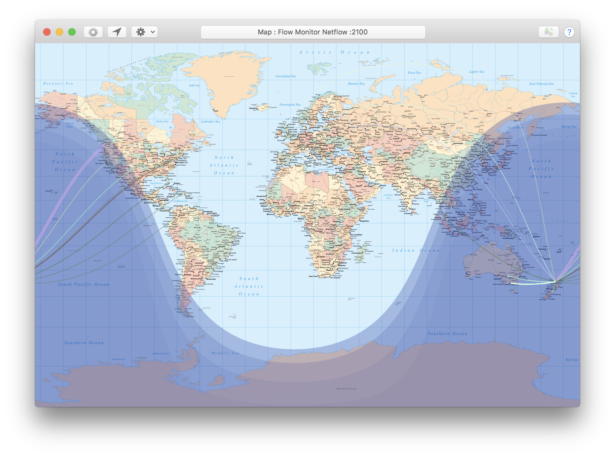
The Map
In the map pictured you will note a few features:
- Lines from New Zealand (where I live) to other points on the planet.
These lines represent network flows between my computer and hosts and
the remote locations.
- The lines are curved because the shortest distance between two
points on the surface of a sphere is a great circle. On a 2D map using
the Mercator projection, these circle arcs become curves.
- The lines are of different colours. WhatRoute can be configured to
represent different network protocols by different colours on the
map.
- Some lines are brighter than others. This is because WhatRoute can
fade the line as it ages (i.e. since activity was last detected
on the flow). Fading is enabled/disabled via the quick access dropdown
menu or in the map settings.
- Whats with the crop circles? The circles represent the range of
accuracy in the location provided from the geoserver engine. These
circles are distorted by the Mercator projection although in general
their radius is too small for that effect to be easily seen.
As you hover the mouse over the centre of one of the circles, you will
see the mouse pointer change to a +. If you click at that point, a dialog will appear showing detail of
the networks that have been determined to be near that location. When
you click Show detail in the dialog, Apple Maps (or your preferred viewer) will
be invoked to show a more detailed view of that point.
- You can optionally display the place
regions, used by WhatRoute to more quickly determine the location of
the place nearest to the mouse pointer. The name of the nearest place is
displayed in the top right corner of the map.
The place regions are 5 degrees on each side. When searching for the
nearest place, WhatRoute first looks in the region under the mouse
pointer and its 8 immediate neighbours. If no places are found (i.e your
mouse is over the middle of a large empty area) then all regions are
searched.
- Places are cached. You can clear the cache in View/Show
Inspector window.
- Show or hide night time with Night region in the action
menu. The bands in the night region represent the
twilight zones -
civil, nautical and astronomical. Display of the twilight zones can be
enabled or disabled in the map settings.
Copyright © 2016-2026 B.R. Christianson (bryan@whatroute.net)